
Getting someone to believe in a number they haven't reached yet.
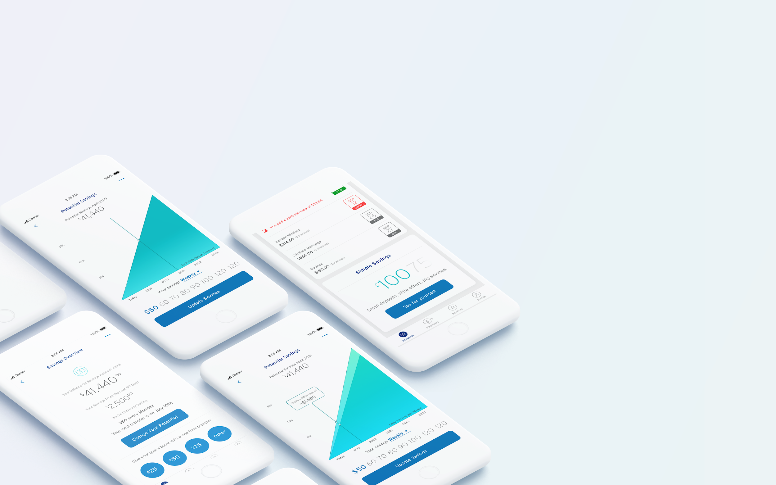
Customers wanted to save more and didn't trust their own habits. I designed the Simple Savings MVP around one idea: make a small, boring, repeated deposit feel like visible progress.
Saving works. Believing it will work is the hard part.
The business wanted deposit balances up, more savings accounts opened, and a credible position in the savings market. Customers wanted something less measurable: to feel like they were getting somewhere.
Those aren't in conflict, but they need different design. A balance figure satisfies the first and does nothing for the second. $50 looks like $50 whether it's the start of something or nothing at all.
Two mental models, tested against each other.
Eight individual usability sessions and two focus groups with co-creation exercises, then a second round of flows built on what the groups surfaced. Six participants in the head-to-head: three existing Citi customers, three not.
Projection-first showed potential growth over twenty years, anchored on contribution size. Goal-first started from what you're saving for and computed the contribution needed. Same product, opposite entry points.
Projections motivate
Seeing what you could have is what gets someone to start.
Balances satisfy
Seeing what you do have is what makes them come back.
Not everyone sets a goal
A meaningful share want to save without naming a reason. This was the decisive finding.
Projection led. Goals became optional rather than a gate.
The projection carries the motivation, the balance carries the satisfaction, and both are visible without a setup step in between. Small deposits, little effort, progress that reads as real. The tile had to feel like a promise, not a chore.
It shipped to customers with Citi Checking and Savings accounts. Then the number that mattered arrived: click-through on the entry point was 20% for first-time visitors. The product was fine and nobody was finding it.
So I went back in. Three prototype variants (static, animated, contextualised), survey-driven research with a researcher, and a rebuild of how the feature introduced itself on the account home. We worked with engineering on the in-house A/B platform to measure it honestly rather than assert it.
Goal-setting as a required first stepCleaner product logic, worse conversion. Research was unambiguous that many customers want to save without naming a reason, and a gate turns them away at the door.
Gamified streaks and badgesTested as patronising in a banking context. Trust was the scarce resource and playfulness spent it.
Leading with the twenty-year figureImpressive and slightly unbelievable. Projections motivate right up until they read as a sales pitch.
The second pass was the one that mattered.
The MVP shipped and validated the model. The entry-point redesign is the part I'd point at: targeting a 30% conversion lift and a 50% impression lift, measured properly on a platform we built to measure it.
The lesson I kept: a feature nobody finds is indistinguishable from a feature that doesn't work. Discovery is design work, not marketing's problem, and it deserves the same research rigour as the thing being discovered.
Post-launch figures are Citi's to share. Happy to talk through the approach.
Got a surface like this one that isn't working?
Start a project