
Engineers didn't need more metrics. They needed the failing one.
I led design across Polaris for two years, from product architecture to billing and admin tooling. This case is the piece I'd point at first: the monitoring surface, which showed everything and therefore nothing.
Technically strong users still opened tickets.
These were data engineers, people entirely capable of reading a dashboard. They still called support, because the tool made diagnosis slower than asking a human. That's not a training problem. That's a design problem.
Three things compounded it: a complex interface with no clear entry point, critical metrics buried without context, and no proactive alerting, so every failure was discovered reactively, usually by a customer.
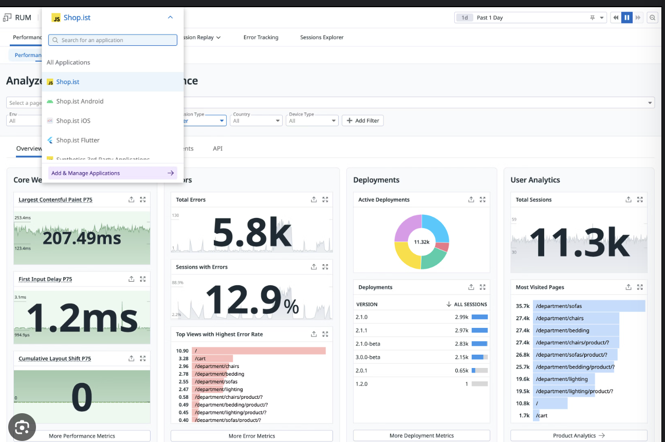
I went to the people fielding the tickets.
Stakeholder interviews with support engineers, PMs, and customer success: the people who absorb the cost of a bad interface. A heuristic audit of both existing surfaces. And synthesis of feedback from enterprise accounts, where the same frustration kept surfacing in different words.
The job to be done landed as one sentence: when ingestion fails, I want to know why and what to do next. Everything the surface did that wasn't answering that question was, at best, in the way.
Even technical users struggled
Navigation and system visibility, not comprehension. The information was present and unfindable.
Metrics lacked context
A number without a baseline isn't a signal. Users couldn't tell normal from alarming.
No proactive alerts
Detection was reactive by construction. The system waited to be asked.
Support was the diagnostic layer
Humans were doing the interpretation the product should have been doing.
I ranked the surface around failure instead of completeness.
Failed and lagging jobs lead. Healthy volume recedes into context, still there but no longer competing. Status became categorical and scannable rather than numeric, because the first question is never "how many" but "is anything wrong."
Diagnostic detail that used to live three clicks deep moved inline with the row it describes. If the answer to "why did this fail" is in the product, it should be in the same place as the failure.
I also shipped the access model underneath: four predefined roles (Admin, Manager, Ingest, Viewer) with scoped permissions across users and IAM keys.
A configurable dashboardThe obvious answer to "different users want different metrics," and the wrong one. It pushes the design problem onto the user at the exact moment they're least equipped to solve it, mid-incident.
Fully custom roles in v1What enterprise buyers asked for directly. It would have shipped a permission matrix nobody could reason about, and scoped roles nobody understands get abandoned for admin, which is worse than having fewer roles.
More alerting surface areaTempting to answer "no proactive alerts" with a lot of alerts. Alert fatigue is the same failure mode as the original problem wearing a different hat.
Support load went down. Sessions went up.
Tickets related to monitoring and troubleshooting fell after rollout. That's the clearest signal, because it's the one the business was already paying for. Session duration and repeat visits to monitoring views both rose, which is what adoption looks like when a tool becomes worth opening.
On the access side: fewer misconfigured-role tickets, higher IAM-key adoption, and a meaningful drop in defaulting to admin. The security posture improved as a side effect of the roles being legible.
Specific figures are under NDA. Happy to talk through them.
Monitoring was one surface of several.
Over two years I owned design across most of the platform's enterprise surface area. The through-line is the same as the monitoring work: technical users, high stakes, and a lot of complexity that had to stop being the user's problem.
Polaris Custom Projects
Defined the product architecture, enabling flexible compute and storage configurations and removing infrastructure constraints for enterprise customers.
Enterprise systems
API management, access control, billing, authentication, and admin tooling. The unglamorous surfaces that decide whether a platform is actually adoptable.
Cost modelling
Simplified the workflows technical users rely on to reason about pricing. Clearer cost decisions turned into measurable gains in adoption.
How the team worked
Introduced structured planning practices and cross-functional alignment rituals. Design velocity went up and ambiguity between product and engineering went down.
Got a surface like this one that isn't working?
Start a project